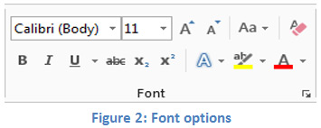
Fonts
It may be tempting to use fancy fonts to dress up documents. However, fancy fonts and small fonts are difficult to read for students and can cause frustration. Tips for using fonts:
- Make sure the font used is easy to read and is clear. Even though students can use the zoom option for reading documents on screen, documents can become inaccessible when printed if using fonts that are difficult to read.
- Use size 12 to 14 for the body of the text.
- Some recommended fonts to use are Times New Roman or Garamond for print and Arial or Verdana for the web as these fonts are the easiest for students to read.
- Sparingly use bold or italics for emphasis of single words, phrases, or sentences. Do not bold or italicize the body of the text.
- Avoid using all caps on large amounts of text as this makes reading difficult.
- Do not use animated or scrolling text in your documents.
